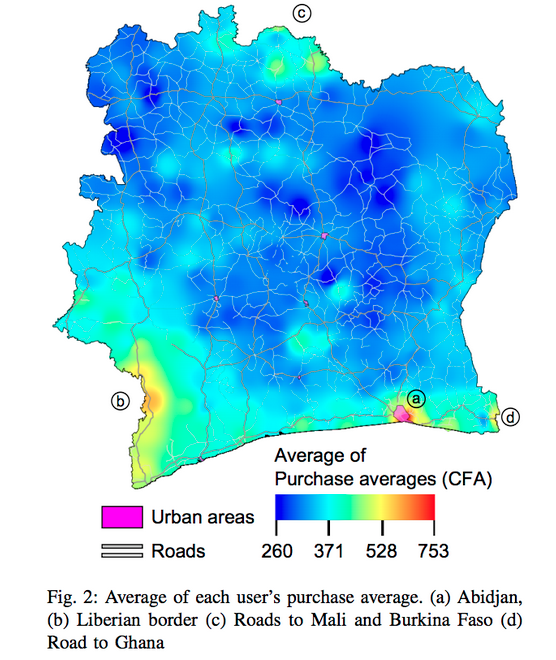
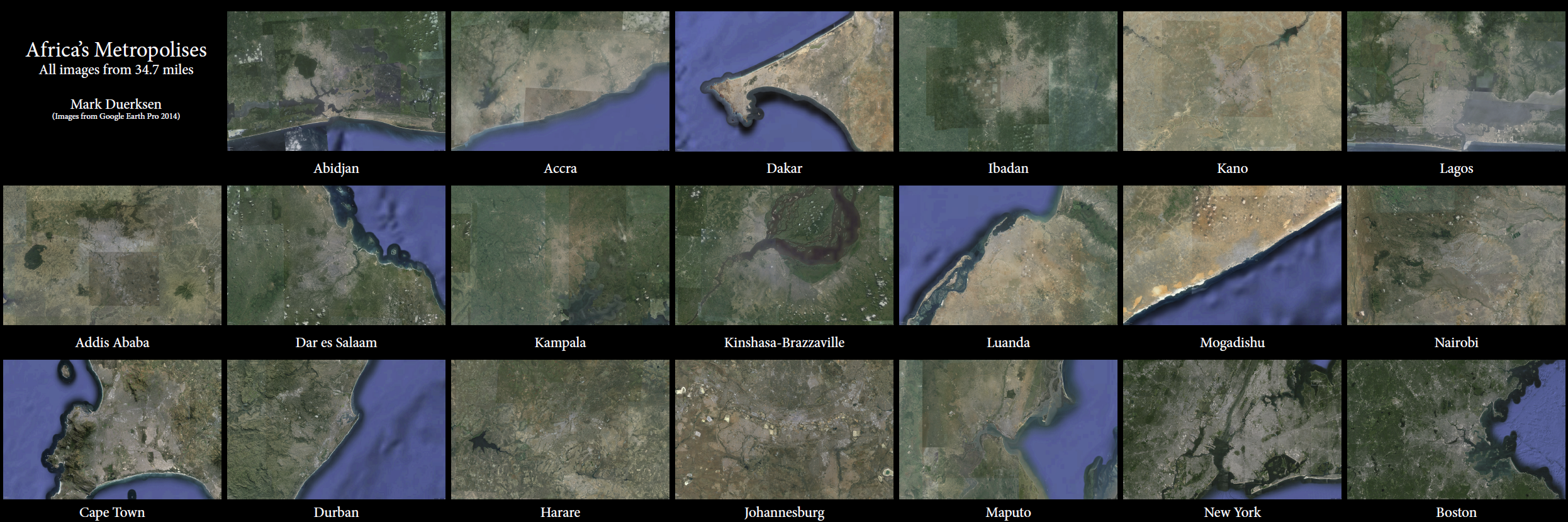
Creating a mashup of aerial images of African cities is something I’ve wanted to do for a while now and today I finally had a minute to put the satellite images together. Here’s the link: Afrian_metropolises. I downloaded all of the images from Google Earth Pro at the same size and scale (from 34.7 miles). The top row shows six of West Africa’s largest cities, the middle row shows East and Central African cities, and the bottom shows southern Africa plus New York and Boston for familiar comparisons (for me at least). A few striking first glance observations include the size of the South African giants Johannesburg and Cape Town, and Nigeria’s neighboring megalopolises Lagos and Ibadan (especially these two Nigerian cities in comparison to Kano, which recent (politically motivated) censuses have given population figures equal to Lagos. This is not to say geographic size of a city is determinant of its population, but the aerial difference between these three cities is readily apparent). Also interesting to note is how obvious (but obviously not a scientific method) it is to tell how paved a city is or is not based on where the city lies on the scale between brown (dirt) and grey (asphalt). There’s a limit to how useful images/maps like this actually are, but it’s fun to look at and helpful to have a for developing a mental imprint of the relative geographic sizes and shapes of African cities.
(Mark Duerksen 2014)