
A blurb in the Atlantic about how researchers are using data on the quantity of airtime sold per purchase to create a heat map of wealth in Côte d’Ivoire. Here’s a link to the actual report. I wonder what other applications research methods like this could have for African countries? I don’t know if it’s possible, but a map depicting the web of airtime transfers would be fascinating.

I don’t know anything about your country. Can you please explain why airtime = wealth?
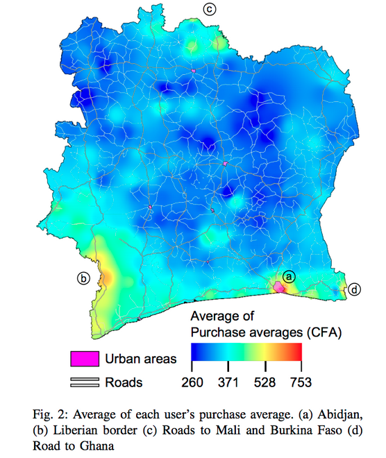
I’ve never been to the Ivory Coast, but in other African countries I’ve visited airtime is literally the time you can use your cell phone over the airways (with texting and minutes of call time having different rates). So these researchers came up with measuring wealth with these pay as you go phones by mapping (based on info from the cellphone company) how much airtime customers bought per purchase by location, with the assumption being that wealthier customers buy larger quantities of airtime at a time (to save the hassle of frequent purchases) and that poorer customers buy airtime in smaller quantities as they have the money. Hope that helps explain it better!
Thanks Mark, I figured it was something like that, but do these statistics exclude business use, Government use etc? I don’t know about Ivory Coast, but in my part of the world, the first people to buy iPhones and other cellular technologies are the students who have no money and have to get loans to support their studies. They might become ‘wealthy’ one day but in the meantime they still manage to buy the cool toys and mobile is their number one form of communication.
Great information. Lucky me I founmd your website bby chance (stumbleupon).
I have saved it for later!